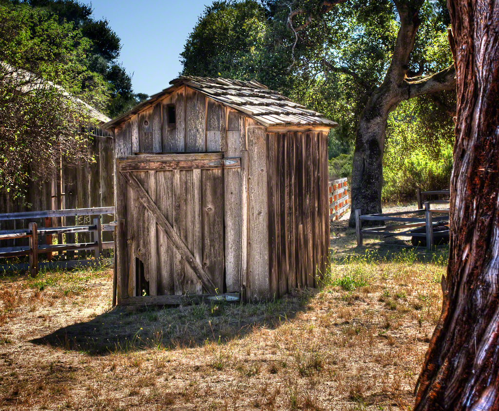
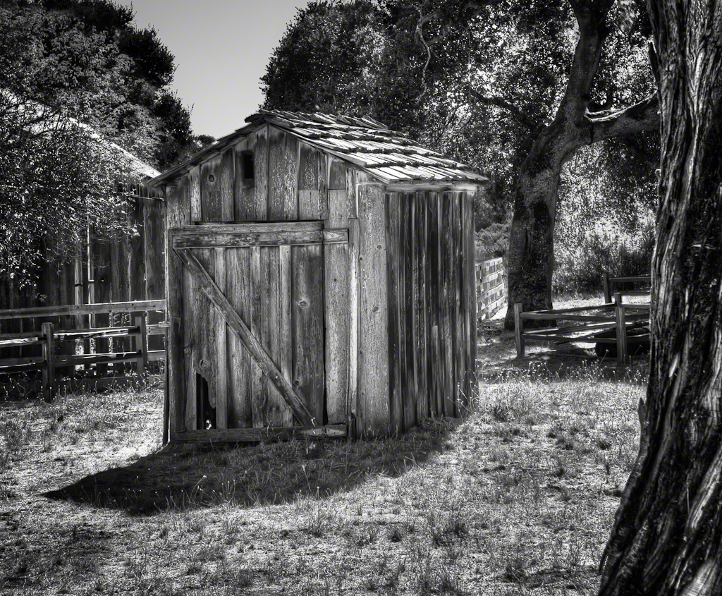
Please help me decide which version to choose.
I’ve processed the images in both color and black & white. You’ll see them better if you click on the color image first, then click on the small double arrows below the enlarged image to see the Black & White version. Then click on the comment bubble and leave your choice in the comment. I’ll post which got the most votes tomorrow. Thanks…
The photo was taken with a Canon EOS 40D, EF17-40mm f/4L lens, as a series of 5 exposures merged into an HDR image. The Black and White version was processed with Nik Silver Efex Pro 2.


11 Comments on “The Outhouse By The Barn, Color or B+W?”
The color is too processed. The tree on the right tends to look artificial and the colored boxes behind the barn are distracting. I like the B&W and I agree that it might look best in sepia.
Outhouse should not be in color
I’d have to say the B&W. It has an eerie quality to it.
Check out today’s posting of black and white vs. sepia tone.
Black and white seems to have more texture. Prefer B&W.
I think a sepia tone or hybrid might work here, as there are positive aspects of both. The detailed texture of the foreground tree seems to compete for attention in my opinion, though it’s balanced with some foreground.
Both have a very “painterly” look to them. I don’t know how else to describe it. They don’t look like a photo and I’d like to “see” them as photographs rather than “paintings.” I always love b/w especially with a subject like this that has such texture.
I’m assuming the B&W was processed after the 5 exposures were merged into HDR. As you know I tend to lean towards B&W. Seeing these two images I’m getting the same impression: the overall texture (the grittiness) of each is the same but with the B&W, the light and dark areas give it more definition; more interest.
I like the color. Don’t I always say that?
I like the b&w, it brings out the shadows. The b&w gives it an old feeling, makes me wonder more about “the story” behind this old outhouse so I think it’s more interesting.
The black and white is the starker image and more striking. A good percentage of the picture is very dark and imparts a sense of substance to the image.